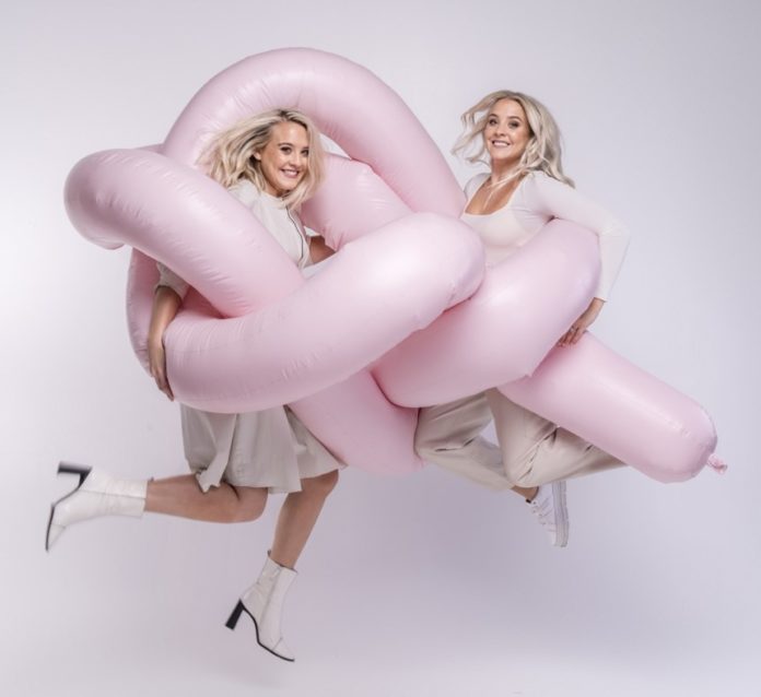
Wellness shouldn’t be an upper-class luxury with expensive products & inaccessible messaging. Our mission is to empower gut health in everyone’. The Mac Twins, Alana and Lisa Macfarlane founded The Gut Stuff after they participated in the British Gut Project and discovered that despite having 100% of the same DNA, their guts shared only 30-40% of the same microbiota. They metaphorically spilled their guts so that ‘everyone’ could get to know their own better.
In 2021, the twins released the book, The Gut Stuff: An Empowering Guide to Your Gut and Its Microbes to spread the word about the real science behind what we eat. The Gut Stuff arms the reader with practical knowledge and tangible tips – both lifestyle and dietary – so they can make easy and life-changing decisions.
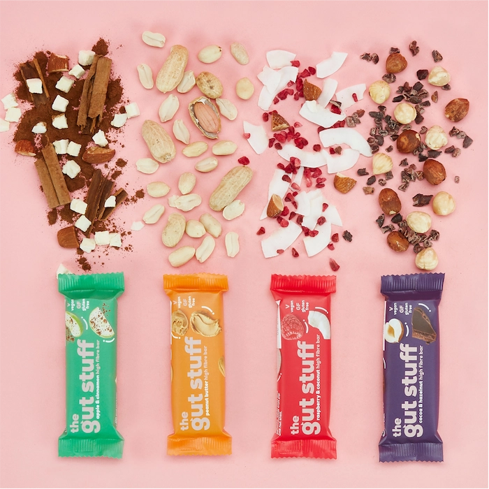
Someone looking for ‘Good Fibrations’ can easily find them on their website which sells affordable and fibre rich bars that are vegan, gluten free and made with no preservatives. One can go a step further and buy their ‘gut diary’ to document their journey to better gut health or take matters into one’s own hands with their All-in-one fermenting kit to make kombucha, kefir, sauerkraut, kimchi, sourdough starter and much more.
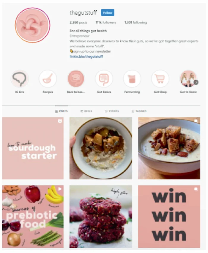
But how does a brand that talks about the microbiome and gut, all guards down, make it to the top of the Aesthetic and Visual Language category? The highest mention goes to their brand colour, ‘Millennial Pink’ or bubble-gum pink which is all the rage for this generation. It has been used cleverly to give a minimalistic and elegant vibe to bowel-movement talks. Supplementing this are the witty puns and word plays around the word ‘gut’, for instance, the ‘I’ve gutta problem’, ‘gut educated’ and other sections on the website make the reader chuckle. The emotional dimension is stressed upon in all communication, evident through the 110 thousand engaged Instagram followers who are not there just for the information but clearly also for the visual appeal of the brand’s content.
Their posters all over London pose a rather intimate question, ‘How do you poo?’ illustrations along with the frank inquiry are also in a rose-hue, offering Londoners an array of possible examples. Affordability, an amicable brand tone of voice, consistent style and a sense of humour gains and retains the customers. ‘The straight-talking sisters are no Gwyneth Paltrow wannabes and their company isn’t part of the ‘eat like me, look like me’ brigade of Instagram. Instead, with the help of a wealth of experts researching this exciting new field, they’re on a mission to bring gut health to the masses.’
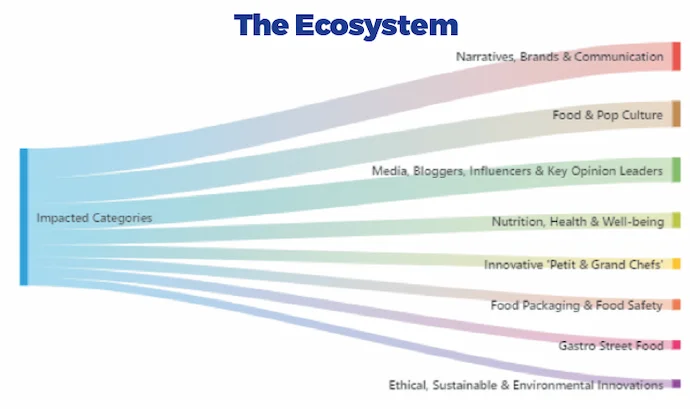
Innovations classified under the ‘Aesthetic & Visual Language’ category impact the ‘Narratives, Brands & Communication’ the most. The significance of how a brand communicates and gets its story across to the customers is well reflected in this
association. Today, just a great product can only take a brand so far and the emphasis on the aesthetic appeal plays an indispensable role in getting through to the consumer.
Most aesthetically appealing innovations have some link to pop-culture which is why ‘Food & Pop Culture’ is the second most affected category. A presence on social media, collaboration with bloggers and influencers is also a key element of visually appealing food innovations which makes sense given that media platforms are highly visual.
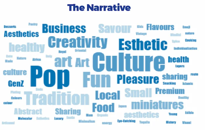
The word-cloud prominently displays ‘Pop’ which refers to both ‘Pop Culture’ as well as the overall quality of popping out if one belongs to the category of ‘Aesthetic & Visual Language’. Other adjectives like ‘Creativity’, ‘Fun’, ‘Art’, ‘Eye Catching’ describe the
kind of vibe that grabs and holds the attention of the consumer. ‘Tradition’ indicates the value attached by the consumer to authentic designs or visuals. Other words like health, flavour, savour etc. clarify that although visual language of food is important, the essential foundation or purpose of food remains intact and still matters.
